Friday, July 27, 2012

What's in it for You?

... a post by HGA painter Linda Carmel

“Beauty is in the eye of the beholder.” People differ in their tastes for art forms and color palettes. People also differ in their interpretation of a work of art’s meaning, with art critics endlessly debating over an artist’s intent. I believe it is important for the viewer to form his or her own experience of a work of art and that there are no right answers.

When I begin a painting, I usually have some ideas in mind - a color palette, a theme, an object or an emotion. As the painting evolves, things change: there is a subtle interaction between my original ideas and what emerges on the canvas. A dance develops between the two. The process of painting can be frustrating until a harmony develops and the painting begins to sing. There comes a moment when the painting tells me that it is done.

When it comes to the question of what the painting is about, my original inspiration may be no longer visible in the painting, as other truths have emerged. Very often the painting leads me on a journey to a new realization that I do not recognize until months or years later.

As an example, in 2006 I had the idea to paint a line of doors that would represent alternative opportunities.

Hollow Victory 2006

During the course of working on the painting, the doors became a line of incomplete figures. I experimented with putting sand into paint for a more textural surface. I liked the look, and I was engaged with the figures, and from this a series of 25 paintings emerged. I added different figures, and other images like mountains and ladders appeared. Each painting fed the idea for the next.

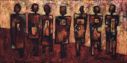
The series developed and I had a coherent story that explained the characters’ environment and existence. I completed the series with The Big Picture in 2007.

The Big Picture 2007

This year I revisited the series in order to continue the journey of the characters I had created. The more I contemplated them the more I questioned my original understanding of them. Now I perceived their world a little differently. I decided to explore the lives of one set of characters in more detail.


Sharing The Load 2012

I am happy to talk about the process of my paintings but I am unwilling to label their content definitively. I do not want to influence a viewer’s interaction with my art with explanations and labels.

I can tell you what I was thinking when I painted them, but you might see something totally different and that, to me, is exciting, that the work is expanded rather than misunderstood.

I hope you enjoy the new series and take away your own interpretation of their meaning.

Thursday, July 26, 2012

Two Painters and a Mosaic Artist Reflect on the Properties of Light in Hillsborough Gallery of Arts’ Refractions Show Opening July 23rd


Linda Carmel, Pam Isner and Marcy Lansman each display their take on the properties of light and color in a new show titled Refractions, which opens July 23rd at the Hillsborough Gallery of Arts.

Linda Carmel’s paintings look three-dimensional, because she uses acrylic modelling paste to build up structure. “In the series of paintings I’ve done for the show,” Carmel says, “I’ve added sand to the mix. The tableaus in the paintings are set against patterns inspired by African textiles, with desert colors juxtaposed against turquoise.” Carmel goes on to explain that fingertips can read the raised areas and sand designs in her paintings like Braille, and she encourages viewers to “read” her paintings that way. “These paintings are a continuation of my sand series and tell stories of home, migration and dislocation,” says Carmel.

Mosaic artist Pam Isner says she’s a big fan of refracting light, a property that can be used to create richness and complexity. “Incorporating glass of varying densities, thicknesses and surface textures within a single art object nicely demonstrates the properties of light refraction,” Isner explains, adding that biology and fantasy inspire her designs. “I like making things that cause one to do a double-take - something surprising, even funny,” she says.

“When I was first learning to draw,” says Marcy Lansman, “I took my drawings to my teacher for a critique. She made the same suggestion for each one: darken the shadows. Then it dawned on me: light is everything. Through highlights and shadows, we create three-dimensional form on a two-dimensional surface. Since then, I have taken special interest in light, and I like to think my portrayal of light sets my work apart. In this show, I’m concerned with the effects of light on flowers and foliage. Long before I became a painter, I was a gardener, and my work reflects that passion. In one painting, I describe the effects of delicate spring light on pale pink pansies, in another the effects of intense summer light on sturdy orange zinnias, and in a third the effect of neutral winter light on evergreen foliage.”

An opening reception for Refractions will be held at the Hillsborough Gallery of Arts on Friday, July 27th, from 6-9 p.m. The Hillsborough Gallery of Arts is located in the Mercantile Building at 121 North Churton Street, in Hillsborough, NC. For more information, visit the gallery Website at www.hillsboroughgallery.com.

Tuesday, July 10, 2012

Transformations

by Mirinda Kossoff
www.jewelrybymirinda.com

In my world of jewelry-making, I sometimes finish what looked like a good design in the formative stages and see at the end of the process that I've birthed an ugly baby. I've learned that there is both challenge and opportunity wrapped in my ugly baby: the challenge of figuring out the mechanics of making changes and the opportunity to make a better piece. Sometimes a piece sits around for quite a while before the lights go on, and I realize what my piece needs in order to be finished.

The first piece below I made in a Celie Fago workshop on combining polymer clay with PMC. The resulting piece met all the qualifications but to my eye didn't look quite right. Celie gave us templates and direction for working on the pieces, so they all turned out similarly. Mine, however, didn't nearly approximate the beauty of Celie's original, and honestly, I didn't want to make a copy of Celie's work. I needed to own the piece as mine - my design. So I took out the polymer clay insert and was left with a hole that needed filling.


The piece went through five iterations but unfortunately, I didn't photograph the middle two. My first attempt, which you can see below, was to attach a copper disk with a fine silver design screwed on top.


It didn't work. Something about the hangy down thingy of PMC and copper just wasn't doing it for me. I got rid of that during another attempt to fill the void left by the polymer clay by loading it with tiny labradorite beads and then making a shadowbox (done by adding a lid with a center hole). The only way to affix the beads was to use cyanoacrylate and the result looked blobby, so I burned out the adhesive (outdoors and using a mask to filter the fumes) and of course ruined the gemstones.

So, once again, I'm looking at a hole inside the lovely PMC "drum." I thought for days about how to fill it. I decided, finally, to use pieces of a sea urchin shell that I'd saved for years. I needed to figure out how to hang the pendant, since the original was hung from a sterling wire that went up through the polymer. I decided on a simple bail and soldered the bail I'd fashioned onto the PMC. I patinated some copper and cut out a donut, then drilled two holes and screwed the donut to the PMC back with tiny brass screws. Then I slipped the sea urchin shell inside with some adhesive. The last iteration had the organic look I was going for. Here it is below. The picture below is the back of the pendant. I learned something through each stage of this pendant's transformation, so the time and effort was worth it.

Do you prefer one of the earlier iterations of the piece? If so, why? Or do you agree with me that the last transformation is the best?